
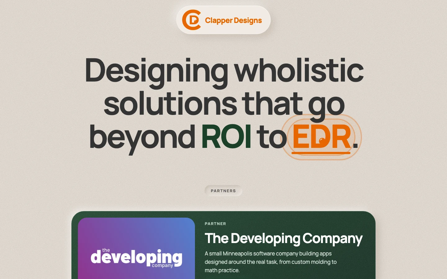
This site is my personal resume work. Clapper Designs is an independent company, so it needed a brand of its own.
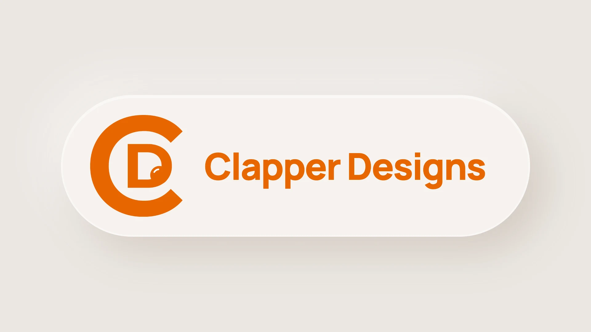
I created all of it: the mark, the colors, the type and the website. The mark is a C wrapped around a D for Clapper Designs, and the eyeball inside the D adds an element of fun and creativity.
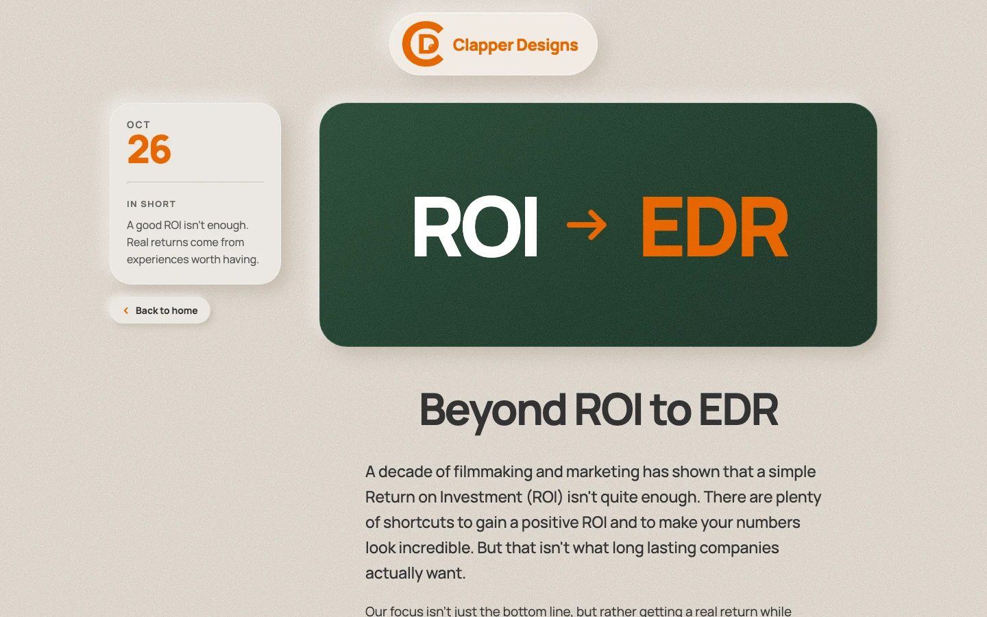
The brand stands behind one idea, EDR, Experience Driven Return: a good ROI is not enough, and real returns come from experiences worth having.
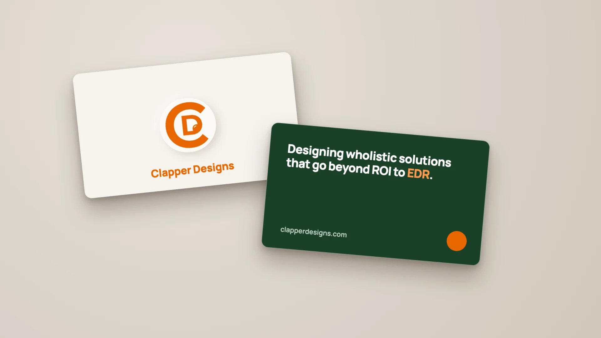
The business cards and the brand board below are mockups I made for this page; the website is live.
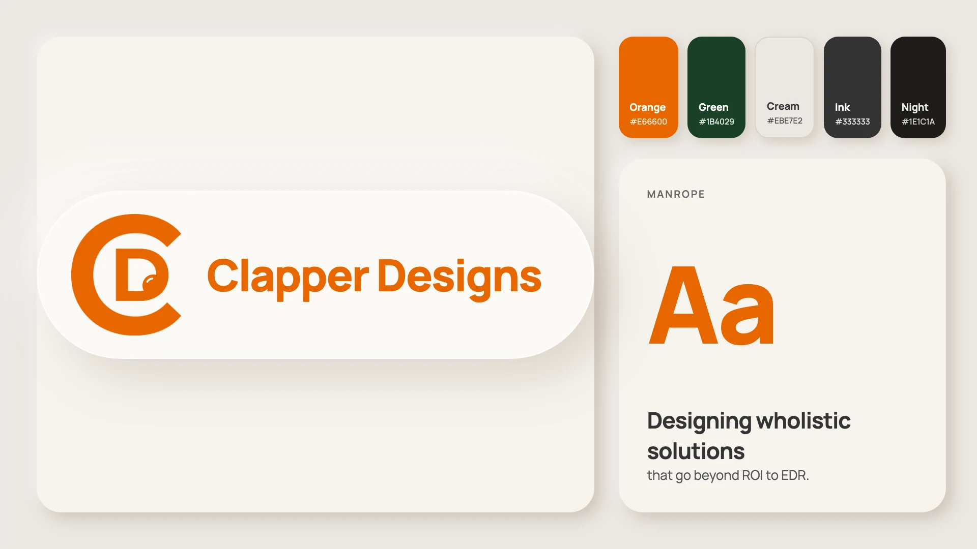
A warm orange and a deep green on cream, with a near-black for night, and Manrope for everything. A brand board made for this page.
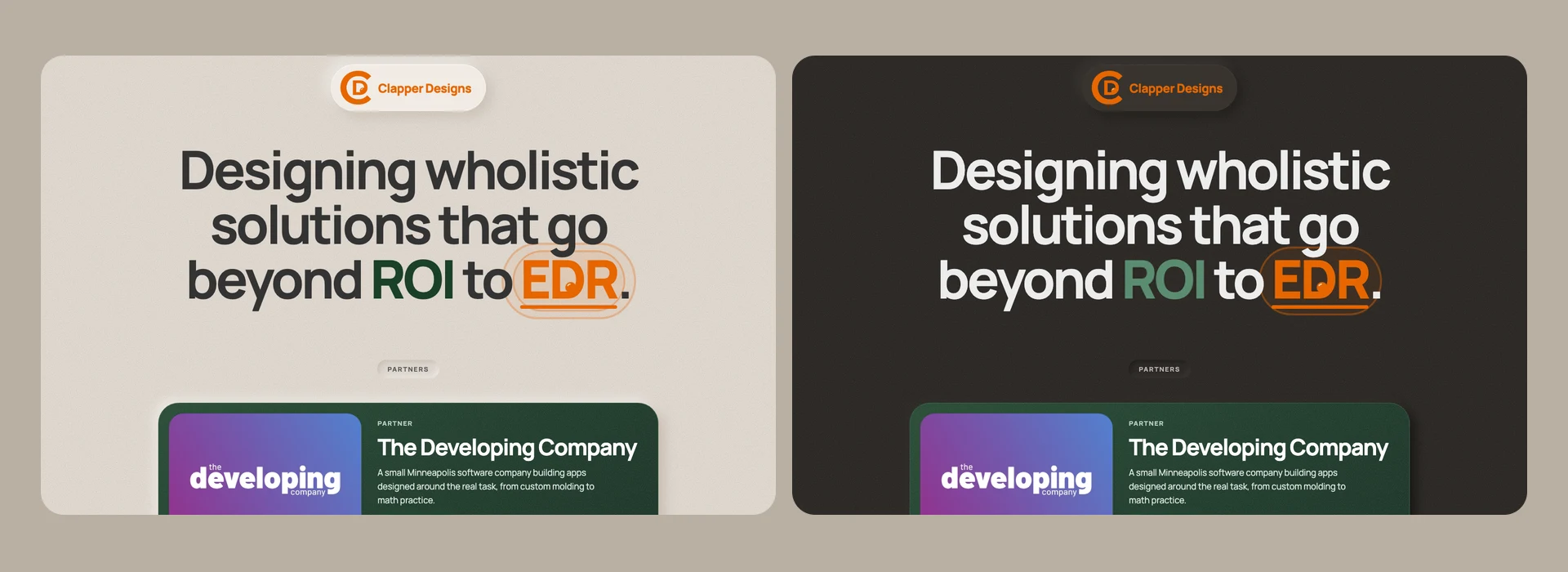
The website comes in a warm cream light mode and a dark mode, and the visitor can switch between them.
A page on the site explains the idea, set in the brand's green and orange.